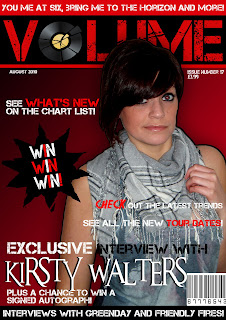
Within the making of the music magazine named "VOLUME," I had to think of how it could be sold within the industry as well as the target audience of different social groups. I feel that it related to the social group and target audience due to the genre of the music.
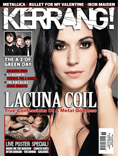
However, I feel that the magazine which closely related to my music magazine is "KERRANG!" as they both have the same target audience aiming at the same genre of music.


Looking above, you can see that there are both similar but different in their own ways.
The similarities include things like the main cover story; both titles share the same colour scheme of white with a drop shadow, created on Adobe Photo shop. Both magazines have used fonts which relate and stand out from the rest of the magazine, meaning that the customer can clearly see who the musician or model is without having to search around the front cover, if unknown. The main use of the colour scheme/primary colours are black, red, white and grey. These colours are clearly shown throughout the front covers to identify the genre and target audience. Looking at both mastheads/titles of the magazine, I can see that they are almost identical in ways in which the font is used. Both fonts display a era of strike-through or a rigid effect, which states the genre and essence of the magazine. However, my magazine on the right shows a photograph of a record, replacing the letter "o" which relates to music and gives the vibe, so along with the title of the magazine and the photo, it cannot be misguided to what kind of magazine the product is. The photographs both used on the front covers are both female women, rather young and share the same target audience of 16-24 years approximately. Both females have both been resembled for a magazine influenced to those of both genders, males and females, and to have a woman on the front cover of the magazine is usually very rare, as the magazine industry is becoming very patriarchal. (male dominated) Both poses given by the models compare and are similar slightly by the strength of the eye contact given to the camera, as this shows a strong and positive posture. The photograph shows a strong posture with a straight on angle to give a fierce expression which relates to the genre and audience given. The hair is given a natural look for the front cover to show a sense of passion and pride for what she is doing. I have used correct lighting when taking the photographs of "Kirsty Walters" by using a lamp for the background as well as additional natural lighting. (windows and ceiling lighting.) However, to ensure that the photograph was a adequate lighting, I modified the photo slightly using Abode Photo shop and changing the brightness and contrast until I found the effect in which I was looking for. I decided not to use any props for my photo shoot due to the fact that when researching current magazines within the industry, not many of them using the genre that I did had props, and used hand movements and facial expressions to make up a photo. I dressed the model up in a scarf, vest top and dark coloured chino's, and top and hair adjusted throughout the magazine, as this was the appearance I chose after researching on http://www.uktribes.co.uk/.
Analysing, comparing and contrasting my contents page with an exsisting magazine within the industry
Looking at a magazine that has been sold within the magazine industry in the past, I can compare and contrast both contents pages. Although the contents I have chosen is not quite as similar as the professional version, the colloquial language is still used to fit the target audience and the genre. The colour scheme is similar, with the use of red, black, white and grey on both versions. However, with the layout of the magazine, I can tell that the column on the left shares qualities together, as it takes up the space of a third of the page, and the headers have a fill colour, with a contrast colour for the text. This has been done to stand out to the reader so it can be read easily. The issue number and date has been clearly displayed so that not only will the customer know which page the contents is from if the page is ripped out or lost, but the house style will, help correspond. As on the left the magazine shows "Q!" magazine, and mine shows "Volume," along the top of the page shows the company in which created the magazine to remind the customer if the page is again, lost. The numbers showing what page each piece of information is on is contrasted from the text and background. The differences within the two contents pages include the fact that they both include a photograph, but Volume shows a CD cover also to promote the singer that is included within the page, which could introduce the readers to be customers and purchase the CD after the magazine. The other difference that I would point out would be that I have inputted a small apart for the editors note, as when researching I found that quite a few magazines have the editors note to enhance the readers and for the editors to explain a little about what's inside the issue, to make the readers/customers want to purchase and read the complete product.
Analysing, comparing and contrasting my double page spread with an existing magazine within the industry


Above shows both my double page spread version of VOLUME and an existing magazine currently being sold or previously sold in the music industry. The both show contrasts between them as well as different effects and types of photographs, but comparing this, the colour scheme is very similar. Both of the colour scheme choices are "Black" "White" and "Red." As you can see, although there are some similarities between both articles of magazines, the genre and layout is also different. Compared to the "Indie Scenester" genre that my magazine portrays, Kerrang gives a rock or heavy metal role specifying on stereotypes among: "Metal head's" "Scene Kids" or "Skaters." Although both versions of the music magazine are relatively different, the magazine shown on the left portrays more information about the celebrity, giving the "Fans" an insight to her lifestyle and to which point in her life she is currently at, whereas Kerrang shows more photographs than text, meaning that the band have probably been around longer than "Kirsty Walters." The differences within both pages include that the colours have been used differently, where as i feel that my text and background colours contrast each other, making them stand out, but Kerrang feels the same as black contrasts white, meaning that the language given by customers or consumers will be easy to read and clear. Both pieces of text include a drop cap text, meaning that the first letter of the article is surprisingly larger than the rest of the text, giving the double page spread a clear effect for presentation purposes.


No comments:
Post a Comment