Before even starting on the task in hand of creating and developing a music magazine which could be sold within the music industry, I analysed and developed magazines to see which magazines were most popular and which genres were suited best among a certain age group. To the conclusion, I found that there were plenty of "POP" music magazines being sold within distributors alike "Asda" and other leading supermarkets, as well as local post offices and corner shops. Because of this, I decided to create and develop a magazine influenced to "Indie Scenesters" so that a new range of magazine could develop and create a range of audience, especially those within the age group of 16-24 year old, to create a "USP" - unique selling point.
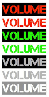
The first thing I had to think of was the title. This included the font, colour and whether it would stand out to the customers if sold within the industry. Knowing my colour scheme included "Black" "White" "Red," and "Grey", I also considered "Neon Green" to see if the colour would suit the genre as it was bright so would stand out. Another factor whilst considering the effect of my magazine was the font. Relating to the genre and style of the magazine, I decided to use a font that was modern looking, stood out and easy to read. The top two choices were my final decision, but something was still not right.
Front Page
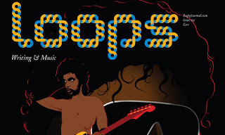
I knew that to attract my audience, my title had to have that something a bit special to it, and looking at my title currently I felt that it lacked something and it needed to be modified somehow. With careful consideration, I researched how other magazines had used effects and photographs. (shown below) "Loops" magazine has edited and modified the title to ensure that the name of the magazine relates to the title, as there are several "Loops" within. The other example I found was "Paste" where as you can tell a font has been used to give the appearance that each letter has been pasted onto the magazine. Concluding from this, I can now see that they stand out so much more than using any font.
After consideration with my music magazine of "Volume" I came up with the idea to input a record disc replacing the letter O. Doing this, I hoped to ensure that the title was still readable, and in hope that it would stand out among other magazines being sold.

Above shows the finished product once it had been edited, and as you can tell it stands out more and correlates with the colour scheme more effectively. When asking for peoples opinions of my finished magazine, this was one of the first things they picked up on as it gave the magazine character.
Another major fact I took into consideration when I was producing my magazine front cover was the colour of the whole page. I decided that I wasn't too sure on the black background with red writing as I felt many current magazines alike "NME" and "Kerrang" had done the same, so I wanted to go for a different aspect and try the grey effect.
I felt that both magazines could stand out to the other magazines within the industry and I found it hard to choose between them both.
I then asked 50 people what one they preferred through the use of school, Facebook and family members. The results were:
Red & Black: 28 Votes
Grey & Black: 12 Votes
Looking back on the two designs, I felt that although more people voted for the red version, I chose the right decision as the colours with the red and black detail contrast but still relate to the colour scheme and "Kirsty Walters" clothing and appearance, so I thought that it addressed the reader greatly.
Contents Page
In order to attract my audience, the contents page had to have bold colours and clear instructions about how to navigate around the page, as well as lots of photographs which are appealing to the user. Comparing my title of the music magazine, I feel they all look similar with bright colours used. I decided to add "contents" to the page just for effect as the leading magazines within the industry had done similar things that fit into my genre.

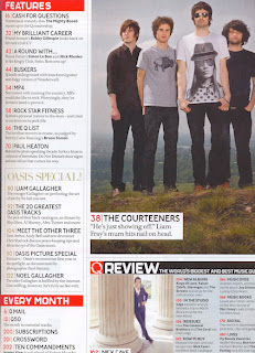
The other important technique when making a music magazine is the layout, especially for the contents. For this, I looked at current and existing magazines within the industry, and researched the best way a contents should look so that it stands out. Comparing both my magazine with Q's contents page, I can see that the layout is very similar, with a large and long column on the left with a small box with additional information within. The use of colour is also similar, with the use of red, white and black, primary colours.
Double Page Spread
The last page which I needed to create was the Double Page Spread. The first step was planning out how/what the layout was going to appear, and researching/planning the photographs as they are a main point to make the magazine stand out. Looking at the photographs, I have found celebrities or current magazines within the industry which displays the same or similar poses and positions as my model.Looking to the left displays both photographs from magazines, from a well known and published one and my own. The pose is similar and I feel it attracts the audience with the wild form of eye contact, with a direct look at the head shot.
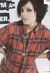

Looking and comparing the second and other photograph used, my model has fulfilled a similar pose and position to Lily Allen. Although the clothing appearance is different, the make-up and hair is close, but I feel that the position attracts the audience via the eye contact and the "hands on hip" movement shows a slight sense of attitude which could help engage the audience within the genre of the magazine.










No comments:
Post a Comment